Revisiting the Heart & Stroke navigation and homepage
CLIENT: Heart & Stroke
SECTOR: Non profit, Accessible design
MY ROLE: UX Designer
YEAR: 2020
Heart & Stroke is a Canadian non-profit charity dedicated to advocacy, education, and the funding of research surrounding heart disease and stroke.
Our mandate was to redesign their current website navigation and homepage. One of the constrains related to this mandate was to be able to integrate seamlessly the redesign with the rest of the existing website.
Another important part of the mandate was to create this website with accessibility in mind. Not only should the website be a minimum of AA compliant, but we also had to keep our core users in mind. Many people who sufered from a stroke or have a heart disease might have some disabilities that affect the way they interact with a website. Some examples include blurry vision after a stroke, not being able to use their right hand correctly, etc. We had to factor in these possibilities and make sure we not only comply to the basic accessibility standards, but we also had to keep accessibility at the heart of the redesign.
By creating a platform with a lot of functionalities, the users have a lot of choices which can be confusing. Too much information is as good as not enough. The hierarchy of information is crucial for users to find right away what they are looking for.
DEFINING THE PROBLEM
Before heading into the redesign, I first wanted to define the problem the navigation and homepage redesign would try to fix. To define the problem, I consulted with internal stakeholders, advisory group (a select group of highly involved end users) and Google Analytics data to draw my own conclusions.
One of the problem the stakeholders talked about from the beginning was the fact that only 1 level of navigation was visible. They felt other important pages were hard to access. Another problem they mentioned is they didn’t know how to balance informative content and storytelling content on the homepage. They also felt the homepage did not evolve with time, staying relatively similar for all users unless they change the content manually.
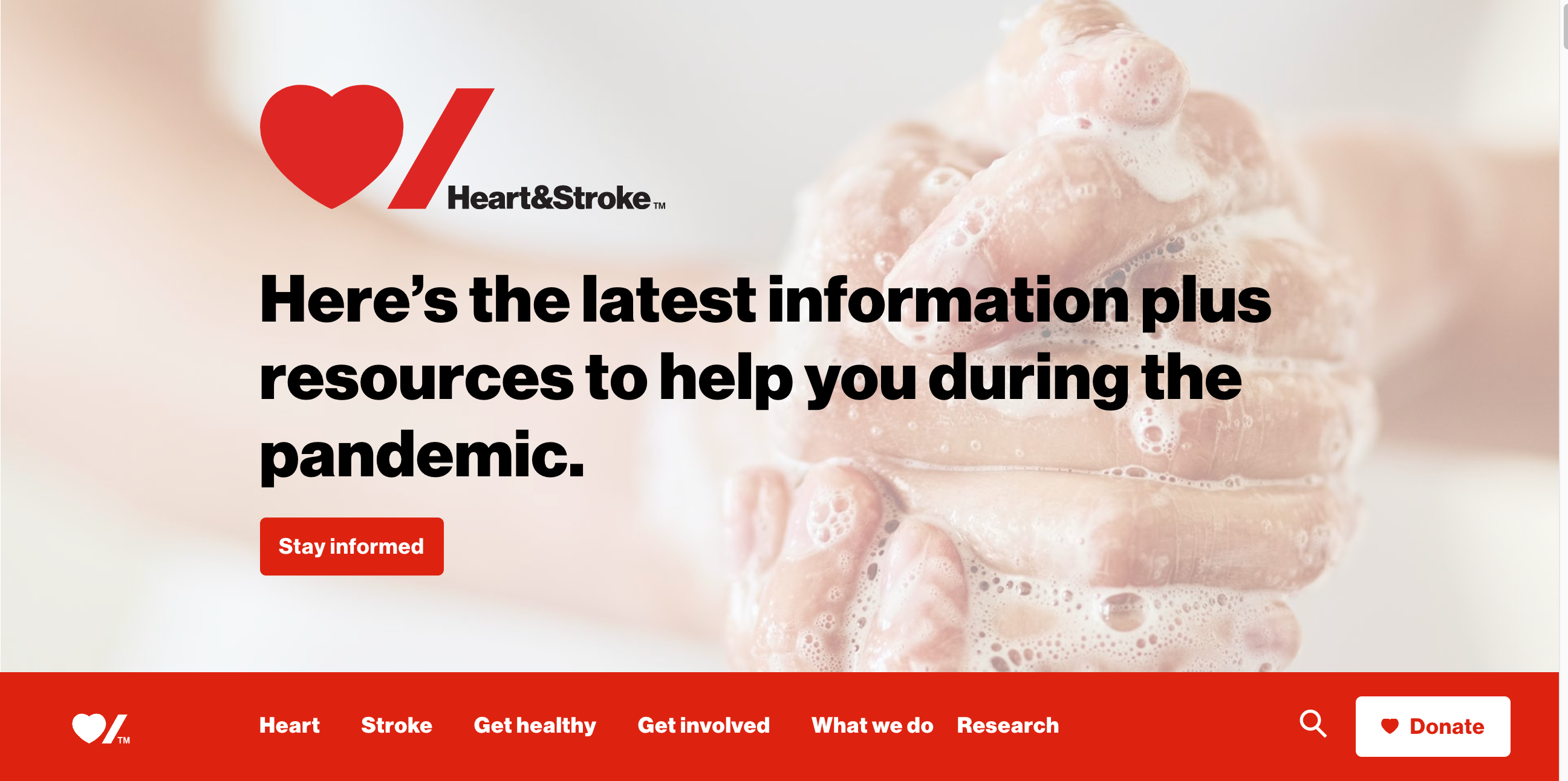
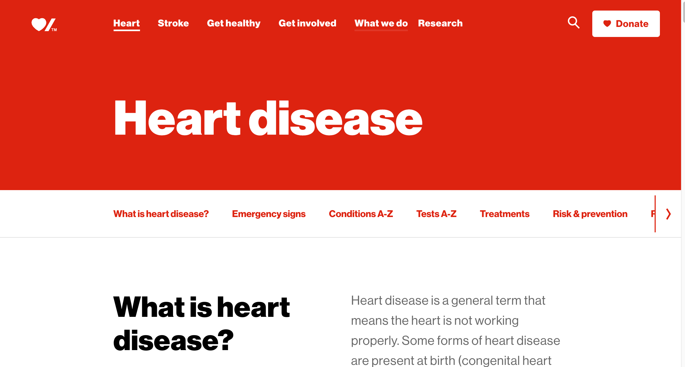
Current desktop navigation and homepage designs
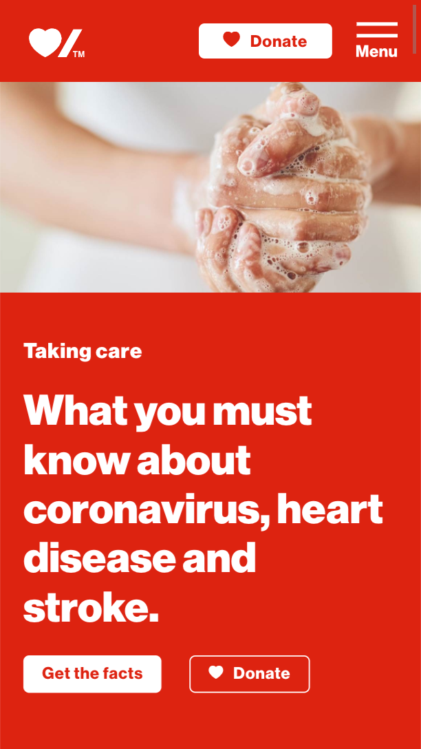
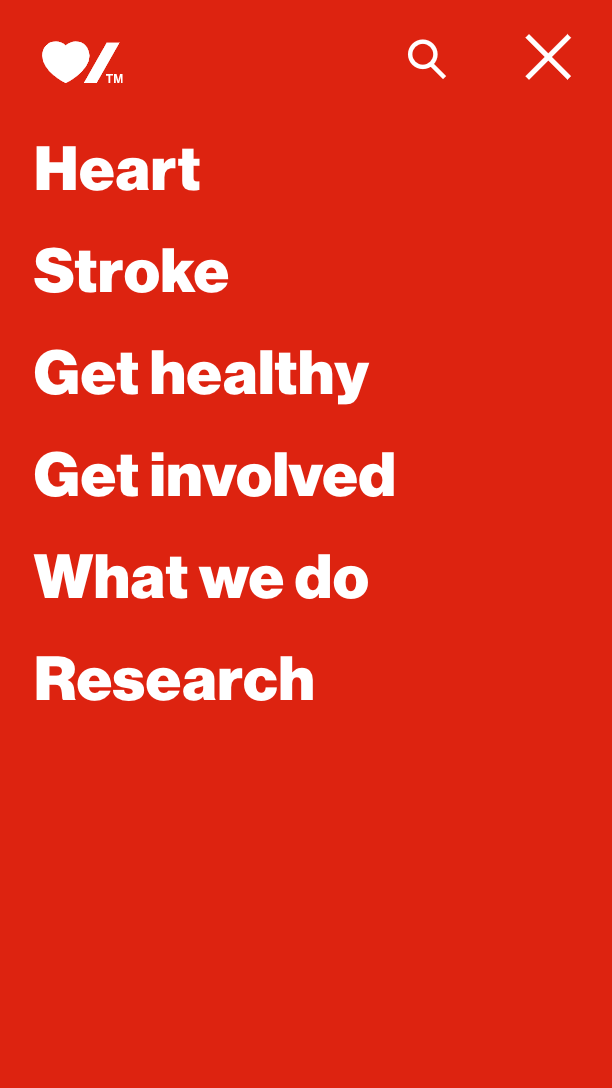
Current mobile navigation and homepage designs
Research
Low Fidelity Wireframes
COMPETITIVE BENCHMARK RESEARCH
I decided to make a competitive benchmarl research to compare how similar websites structure their navigation and compare their labels. I looked specifically at websites dedicated to advocacy and education surrounding a health condition.
The elements I compared were the main navigation categories and labels, the various types of menus and functionalities and footer elements.
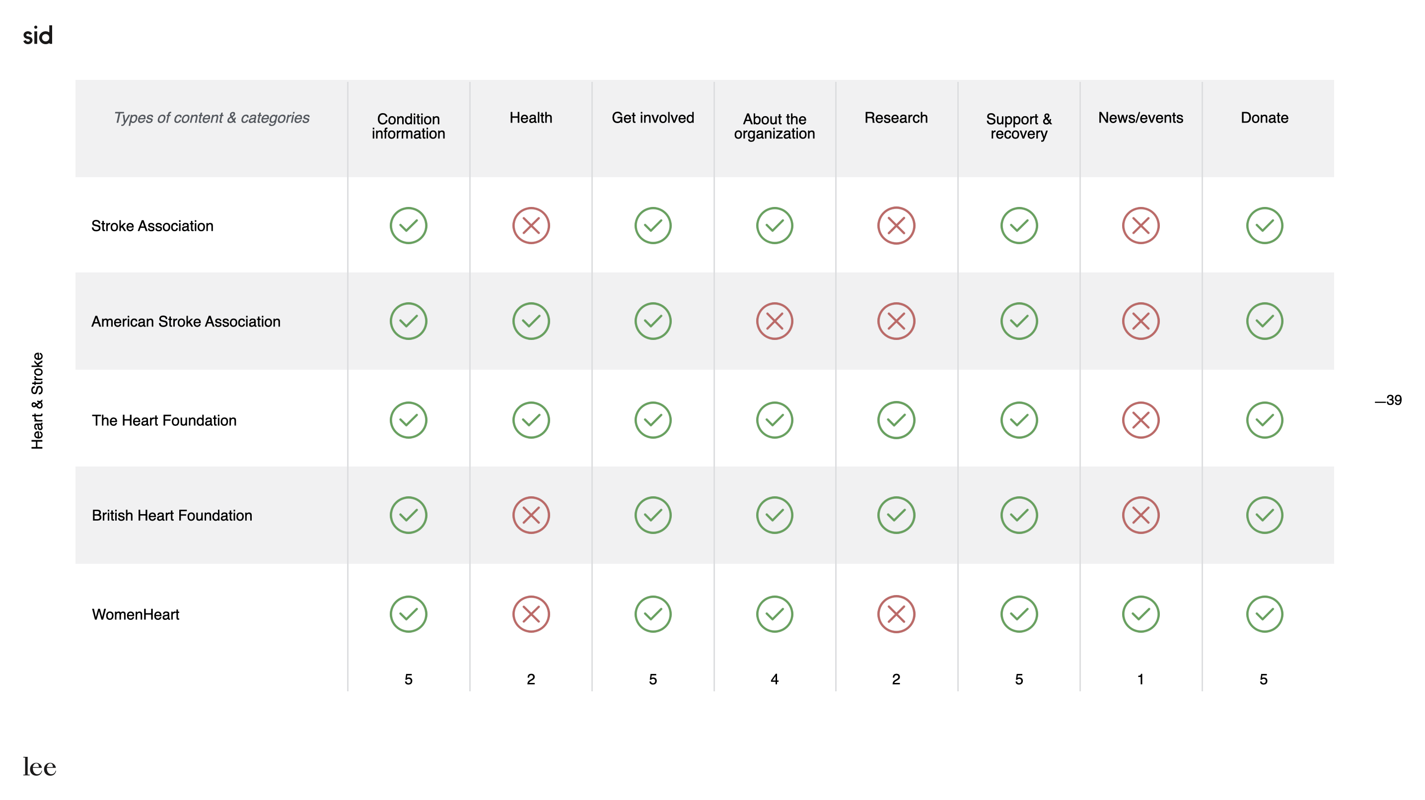
Overall, this benchmark research confirmed a few hypotheses I had and gave me some good insights. Some key insights from the benchmark include:
- Overall most competitors use very similar navigation labels.
- None of the competitors only have 1 level navigation.
- Most competitors don’t have the label «Research » on the first level of the navigation.
- Competitors generally had a wide variety of links in the footer organized strategically.
REVISITING USER PERSONAS
The Heart & Stroke content team had already developed user personas by doing interviews and surveys, but they were aware some personas profiles were missing. Using data analytics and looking at reports of user interviews they had, I developed 2 additional user personas to complement the research.
User personas already identified:
People with lived experience (Someone who has had/has a heart disease or stroke)
Caregivers
User personas I created:
Donors
Health professionals
Adding the personas helped us when we had to make certain decisions and made sure the decisions were based on customer interests. It especially helped when it came to having to convince stakeholders design choices were better for users.
CARD SORTING EXERCICE
I ran a card sorting session that was composed of members the Heart & Stroke advisory board. They are members who are highly involved in the community who are either caregivers, people with lived experience or donors. I used this technique to help determine the main paints points end users were experiencing with the homepage and navigation. It also allowed me to get their insights and opinions on the redesign task I had.
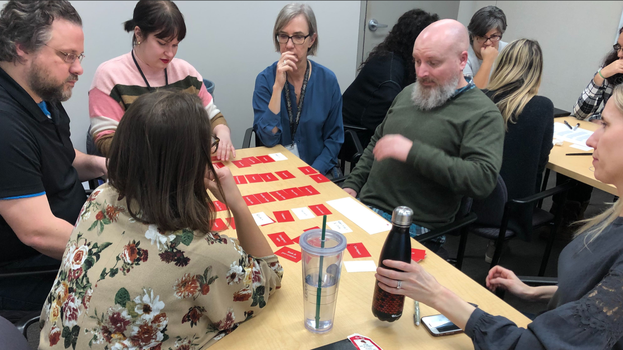
Here are the key takeaways we got from the workshop:
Navigation:
- Make the menu labels and the overall navigation system more constituent-centric.
- Better highlight the reasons to encourage the cause and how to have an impact.
- Improve the footer to make it more engaging and unique.
- Give a central place to the search tool
Homepage:
- Need to find a better balance between emotion, mission and useful information on the homepage.
- Have a homepage that is rooted in current affairs and that showcases fresh content (news, events, publications, hot topics, etc.).
The redesign process
Low Fidelity Wireframes
INFORMATION ARCHITECTURE
Based on the insights gained from the research, stakeholders and end users workshop exercise, I defined a new sitemap for Heart & Stroke. The challenge with the information architecture was that I could only rework the IA related to the navigation and homepage, which pretty much meant the first 2 levels of navigation.
In terms of changes I reworked labels to either add clarity or add context. I also moved the "Research" section down 1 level instead of having it in the first level of navigation. The "What we do" section was reworked as a whole in terms of pages. The section used to be a mix of anything related to Heart & Stroke and I reworked it so it includes what information donors want to see. For the footer, I regrouped all the relevant links and created sections. Adding sections allowed me to add a lot more links without the footer feeling overly crowded.
WIREFRAMES & CLICKABLE PROTOTYPE
For the this part of the process, I worked with a UI designer in the form of a sprint. We worked closely together on every step, so I would often sketch him a quick wireframe, then he would translate it into a high fidelity mockup and I would make adjustment if needed.
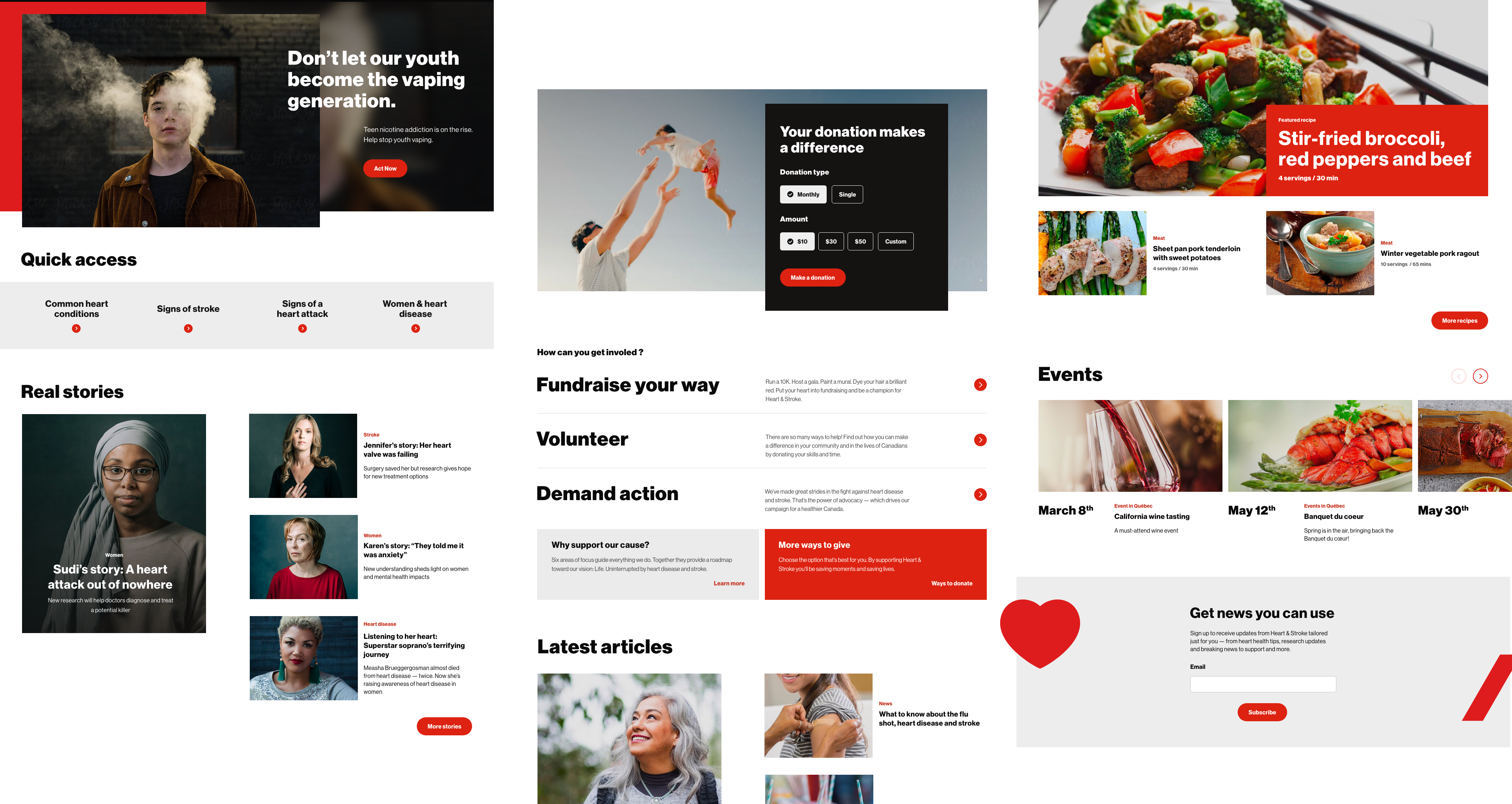
The main changes in terms of layout and structure to the navigation are the addition of a dropdown menu, the addition of a top utility navigation for quick links and adding considerable visibility to the search bar.
For the footer the main changes were explored in the IA of the section.
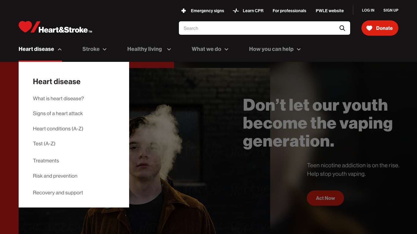
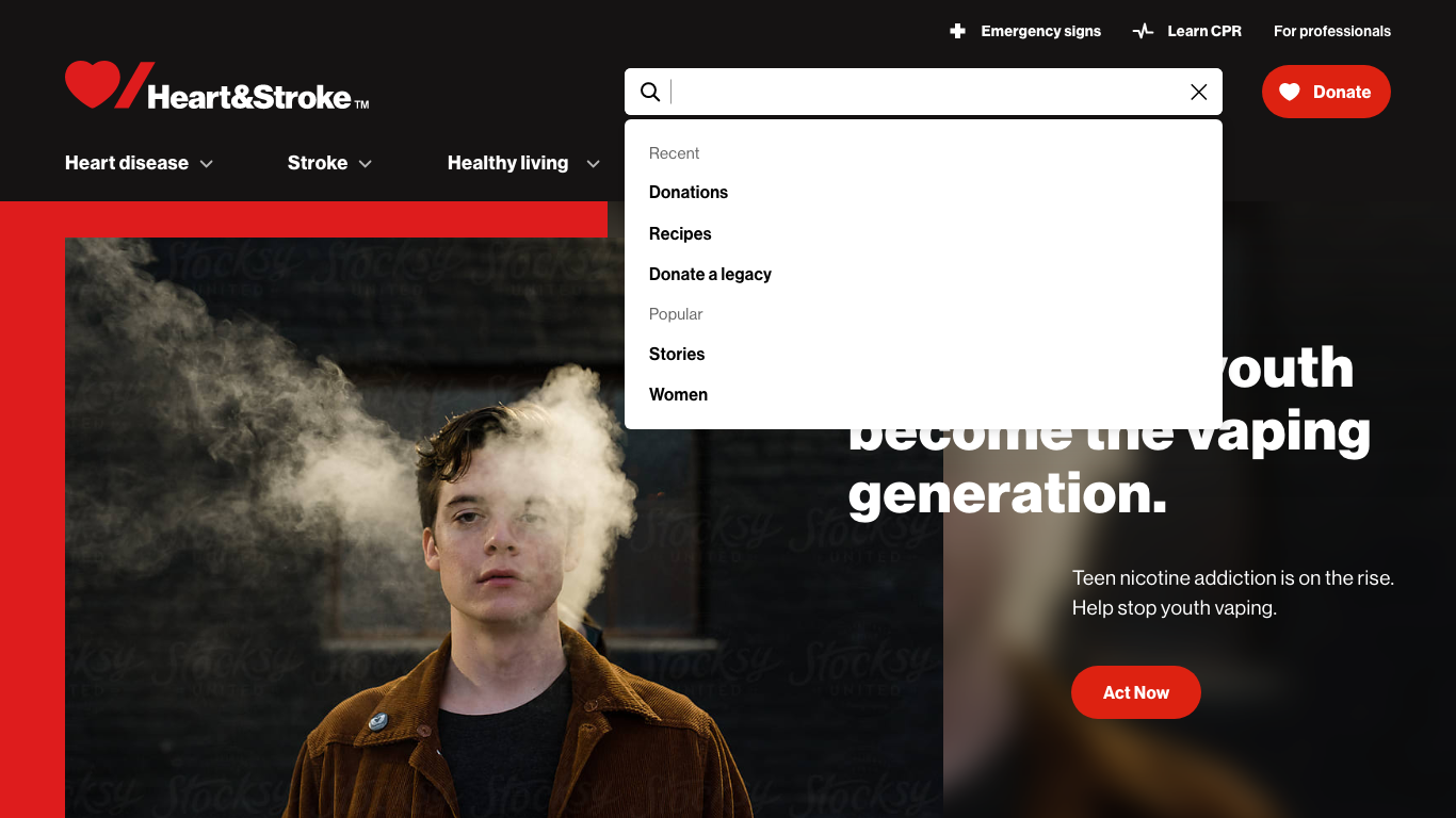
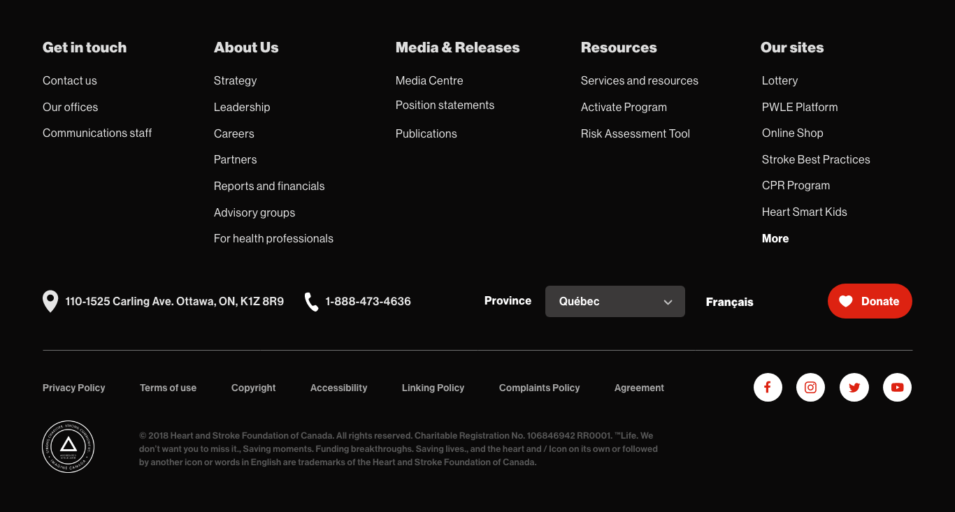
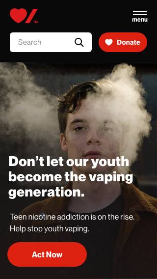
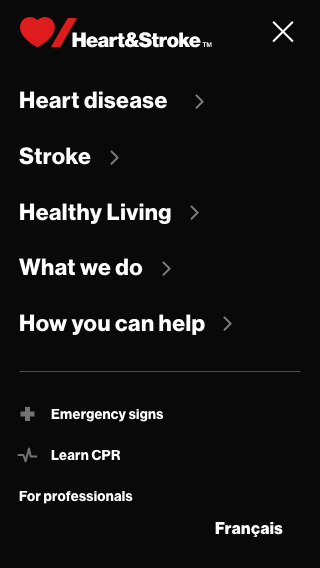
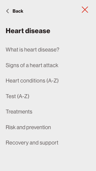
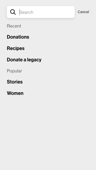
For the homepage, new components were designed and added to better represent the breath of the website. An effort was made to better balance informative content and story telling content.
In addition to the structure changes, personalization will be used once the website is live. We created various personalization scenarios to show how the homepage will adapt to different users. A few examples are how we will use geo location to personalize the « Events » component as well as the homepage banner. Another way to personalize the homepage will be to adapt the hero banner based on the user profile. For example, a user that has donated before through the website can see a personalized banner to explain how the donations are used.
DESIGNING FOR ALL - ACCESSIBLITY FIRST
Designing accessible websites should be the norm nowadays, but considering the users of the Heart & Stroke websites, we focused particularly on accessibility throughout the design process.
How design played a role in making the website accessible?
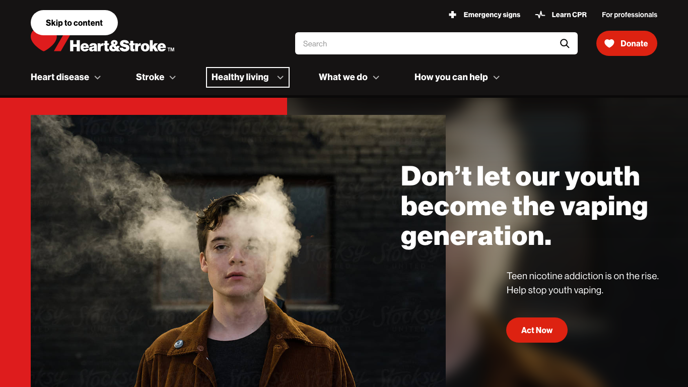
We added a « Skip to content » button to allow users to skip the navigation when tabbing on the website.
We designed custom focus indicator for keyboard navigation. Since some users might have to use the keyboard navigation, we thought it would be a good addition to design a custom focus state, instead to using the default once from web browsers.
We made sure all the colour contrast were at a minimum level AA and we tried to aim for a Level AAA most of the time. This is not to mention how we made sure call to action were large enough and fonts sizes were easily readable.
RECRUITMENT & USABILITY TESTING
We originally planned on having a recruitment firm do the recruiting for our user tests, but because of budget constrains and because we wanted to keep as much work in-house as possible during the COVID-19 crisis, we decided to do the recruitment ourselves.
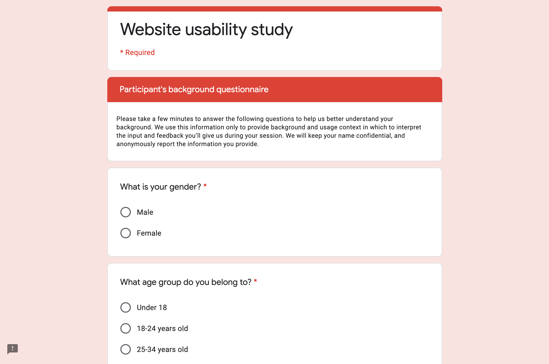
I started by identifying the test user profiles; identifying which user persona, age, gender and ethnicity we wanted to recruit for our test.
Then the client allowed us to use a Hot Jar pop up on their website to ask users if they were interested in participating in s user research. If the users were interested, we redirected them to a Google Form survey where we asked specific questions to know who would fit in our user profiles.
For the first time, we ran remote user tests of in-person ones. We interviewed 8 people and test both the desktop and mobile prototypes. Overall, because of the software we picked, the tests ran pretty similarly to the ones we usually do in person. After analyzing the recordings, we made some small changes to the designs.
Here are a few of the insights we got from the user tests.
Insight #1: The donation CTA placement and UI was clear enough for users to always find it quickly. Overall the users were overhelmingly happy with the donation configurator component. They actually preferred using it than not.
Insight #2: The health professionals participants had a harder time finding their information hub in the footer, so a quick link in the utility nav was added.
Insight #3: Half the participants used the nav to access the 2nd and third level of navigation and the other half used the homepage.
Insight #4: The 2 utility links (Learn CPR & Emergency signs) were easily found by users for both desktop and mobile tests.
Insight #5: Users were hesitent about the label "Signs of heart disease", not being sure if it included signs of a heart attack or no (which it did). I decided to change the label to adapt to the user feedbacks, even though from a technical stance point the correct label would have remained the previous one. I felt using industry jargon does not ultimately help the people who are actually using the website, but rather speak to people within the field only.
Selected Works

