Samsung Online Store
Redesign of the US website
CLIENT: Samsung
SECTOR: Ecommerce, technology, telecommunication
MY ROLE: UX Designer
YEAR: 2020
Sid Lee got the mandate to create a new CX Vision for Samsung.com/us and also develop new creative ideas on how the website can be improved. This was done by challenging the current way of thinking of Samsung by proposing key design components that can eventually be implemented across the global shopping experience.
Our client was Samsung Korea, but throughout the project we collaborated a lot with Samsung US since the goal was to eventually implement and test our ideas in the US market. This project was in its form a pitch to Samsung to propose new and innovative ideas.
The design task involved great consideration into a modular sense of working to overcome the challenges of designing eventually for a global market.
One of the challenge throughout the project was to deal with various big departments within the Samsung company. There was the Korean client and the American client who did not necessarely had the same visoin. Then we also had to navigate through the different political dinamics of various product departments (Mobile division, appliances division, etc.) within the company.
By creating a platform with a lot of functionalities, the users have a lot of choices which can be confusing. Too much information is as good as not enough. The hierarchy of information is crucial for users to find right away what they are looking for.
THE PROCESS
The overall process of the project was to start with developing the new CX vision for Samsung.com/us and use that vision to guide our design sprints after.
After developing the CX vision, we formed a set of high level goals and hypotheses on how we could improve the website and reflect the new vision. We then prioritized which page templates and components we wanted to bring to life.
For each section or component we wanted to design, we worked in sprint to deliver the final visual mockups.
Research
Low Fidelity Wireframes
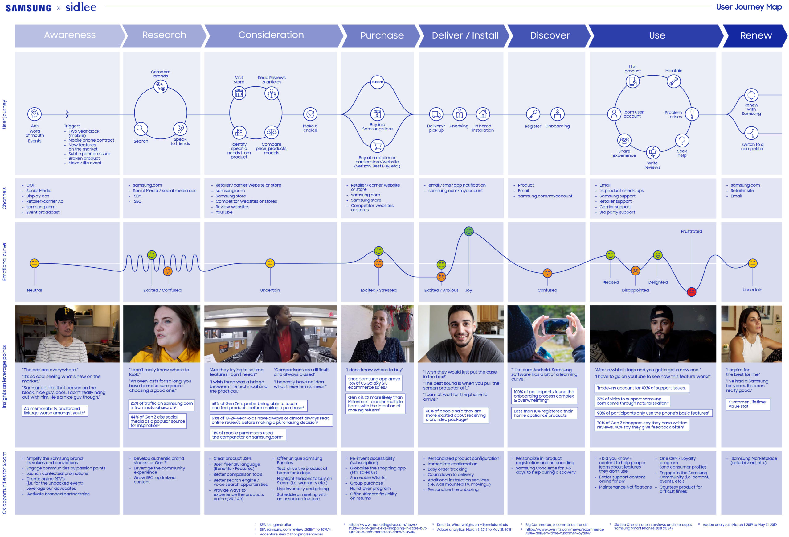
USER JOURNEY MAP
I created the user journey map as part of the research that was done for the CX vision proposal. From an ethnography research that was done by a NYC research firm, I developed the user journey map to help visualize the journey of our new users; the millenials and Gen Z.
"Dreamers with purpose"
BENCHMARK RESEARCH
Another tasks I worked on to support the CX vision deliverables was a full benchmark research & best pratices guide. As a reference, I used the research that was done by Baymard Institute. The research was done to analyze each part of an ecom website (navigation, homepage, category page, product detail page, checkout process, etc.) and go over the UX best practices for each type of page.
CONSOLIDATION OF NEW CX VISION
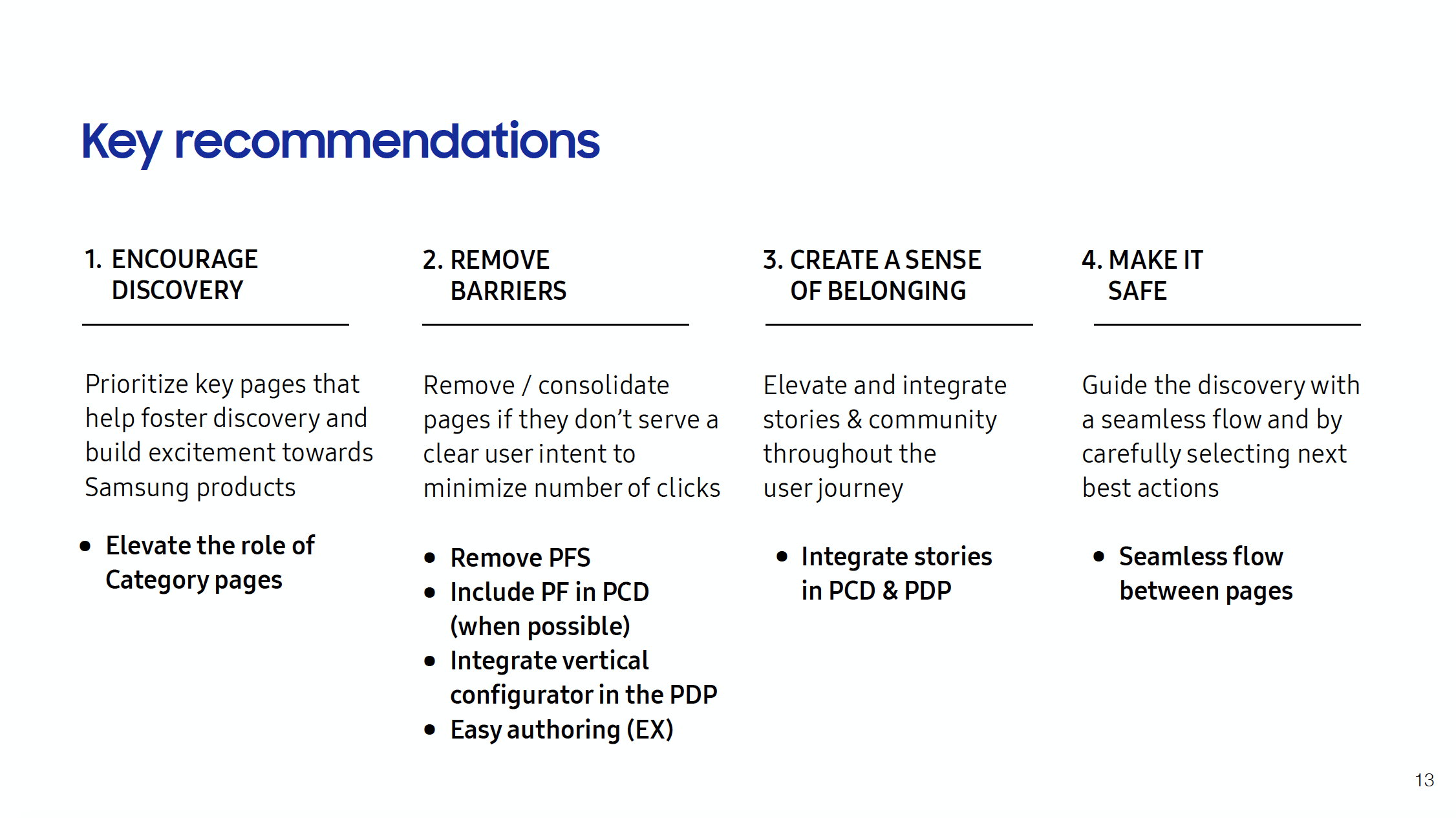
The new CX vision that was created by the strategy team identified 4 key experience principles to follow to bring the vision to life. The UX and designs team then used those principles throughout the redesign to guide some of our decisions.
- Encourage discovery
- Remmove barriers
- Create a sense of belonging
- Make it safe
The redesign process
Low Fidelity Wireframes
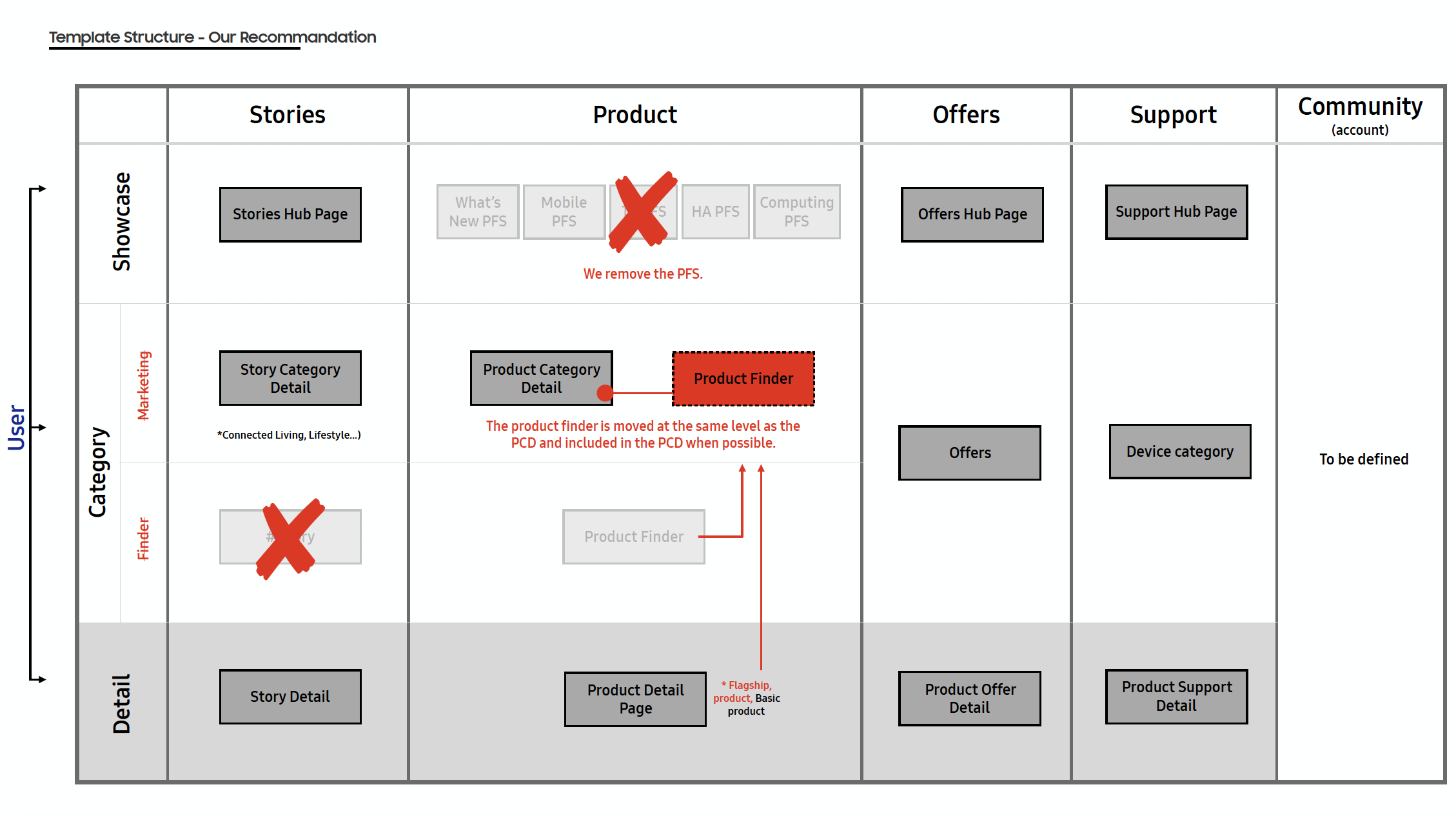
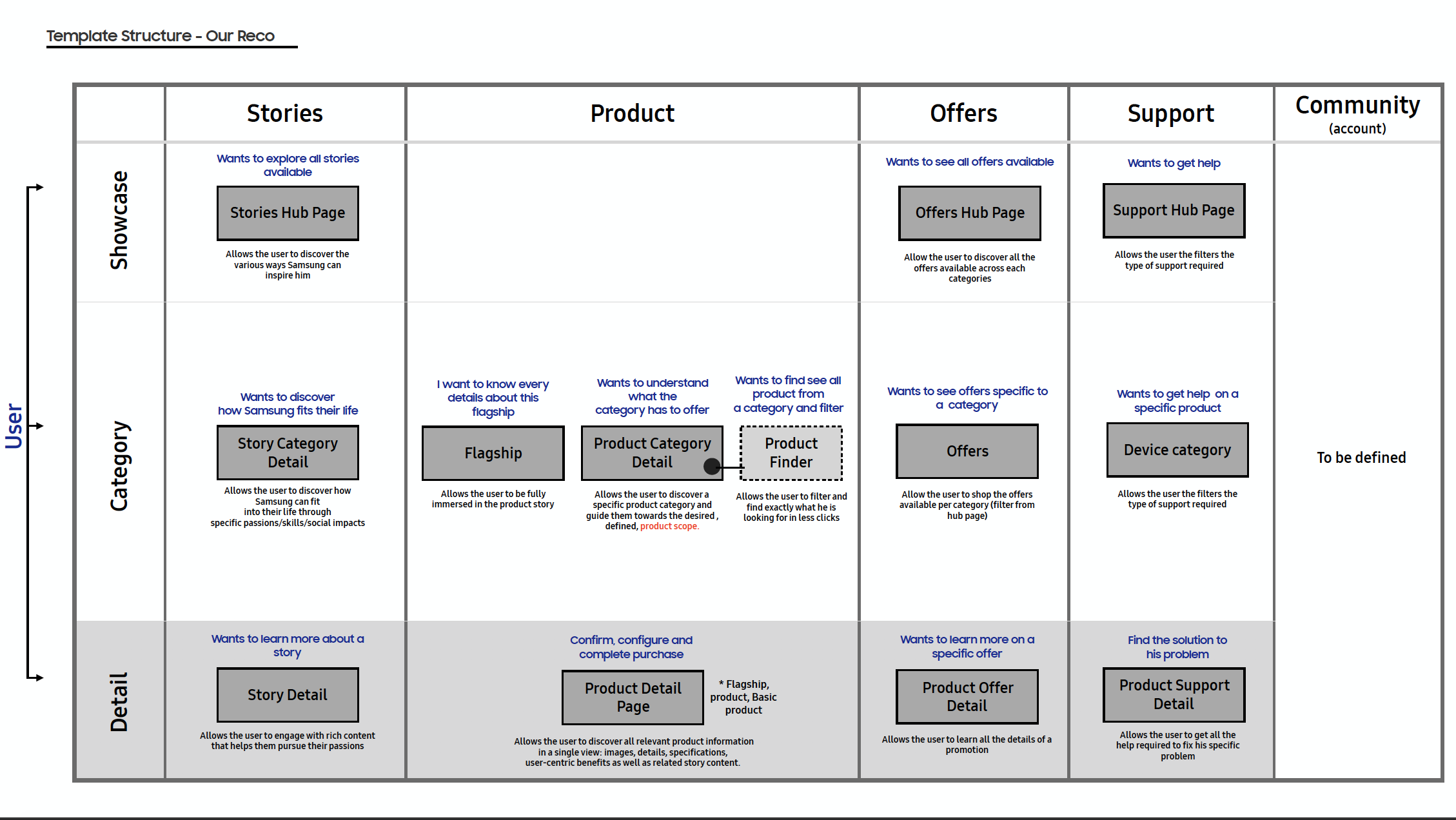
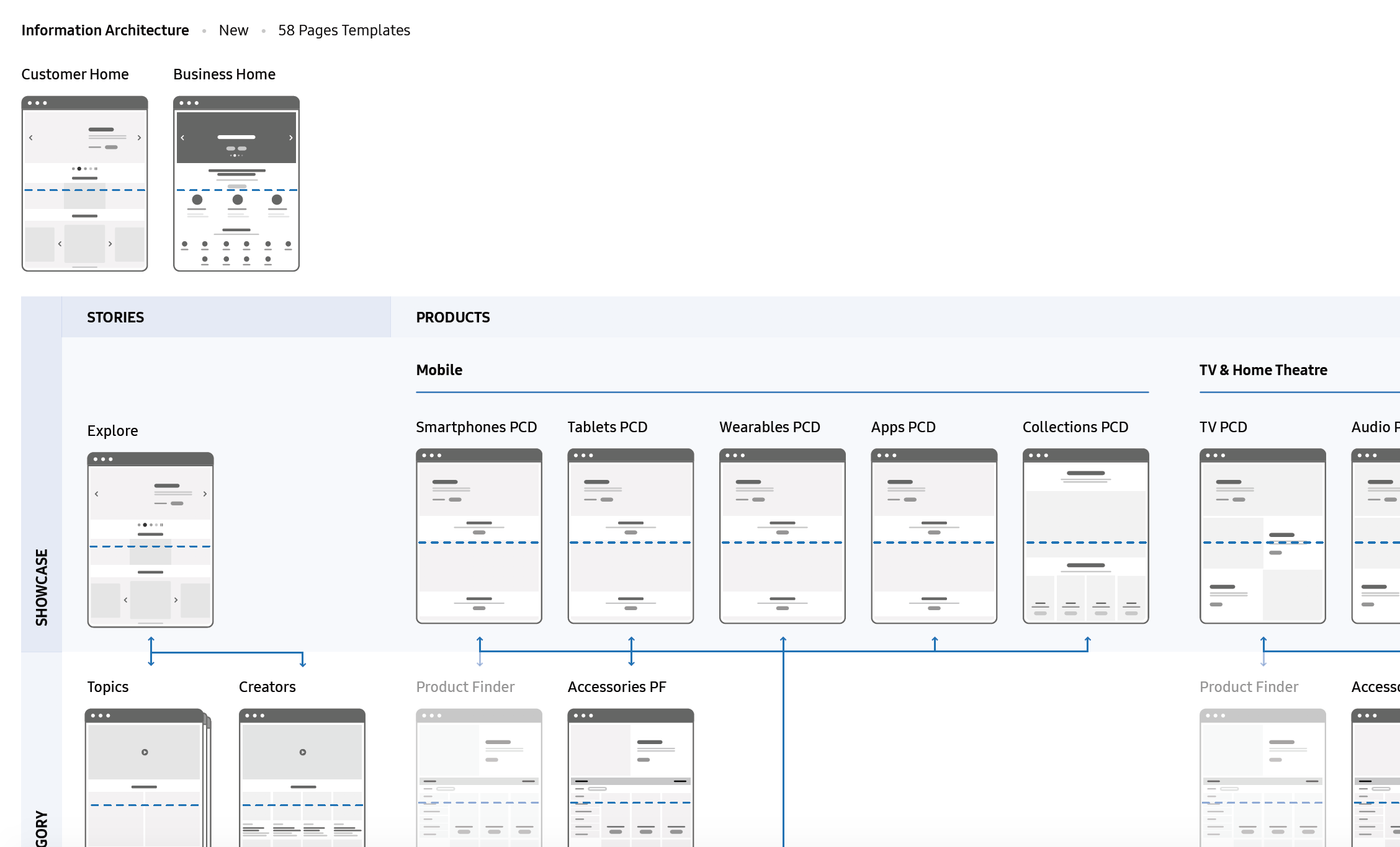
INFORMATION ARCHITECTURE
To build a playground for dreamers with purpose, we need to revise the IA of the site to best serve each and every dreamer’s need & intent.
- Prioritize key pages
- Improve the flow from homepage/navigation to the product details page
- Integrate storytelling throughout pages
PRIORITIZE DESIGN HYPOTHESES
After creating the CX vision and new information architecture, we focused our effort in prioritizing which page or design element we would work on and deliver during sprints. Below are the pages or features I worked on during the sprints.
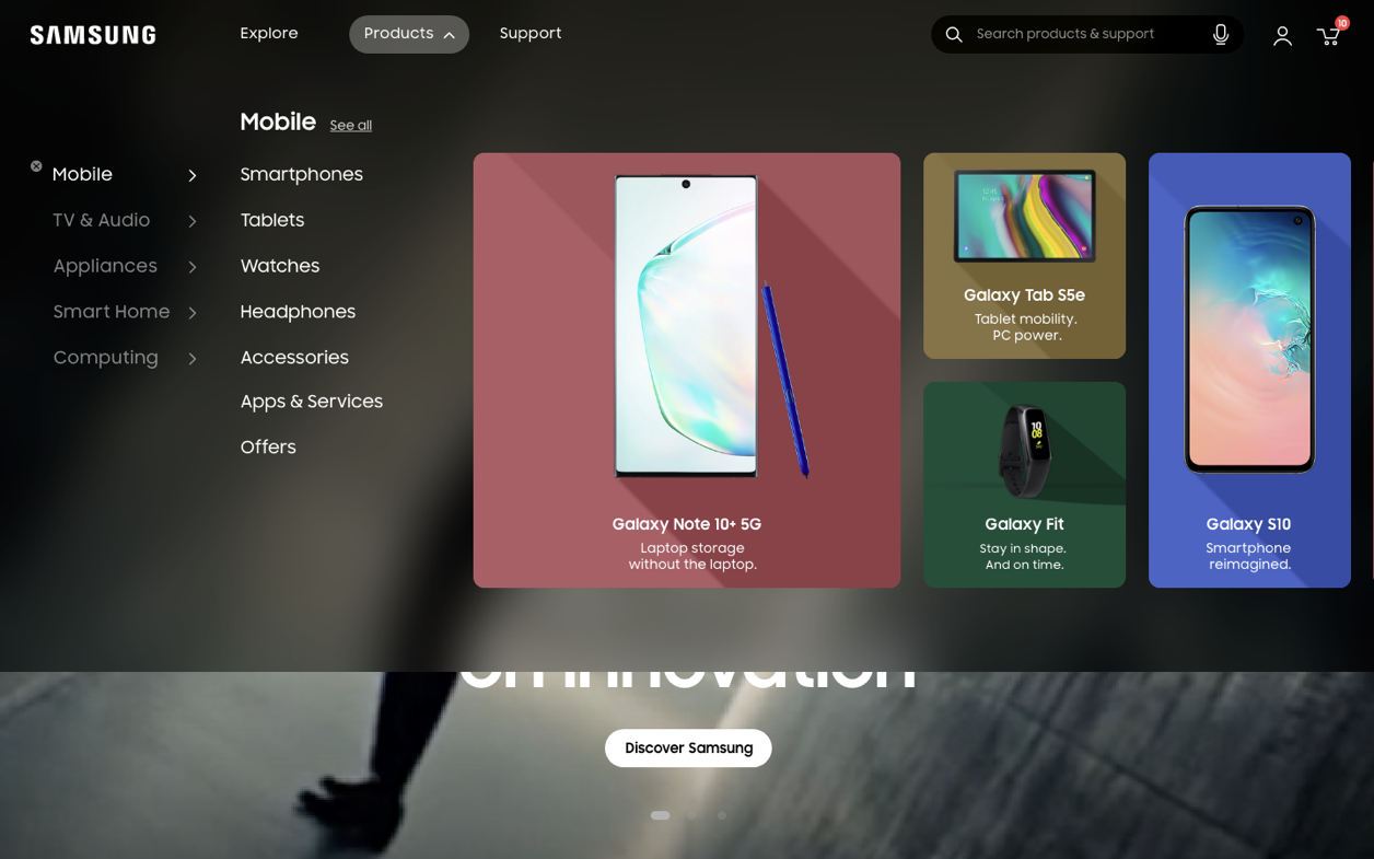
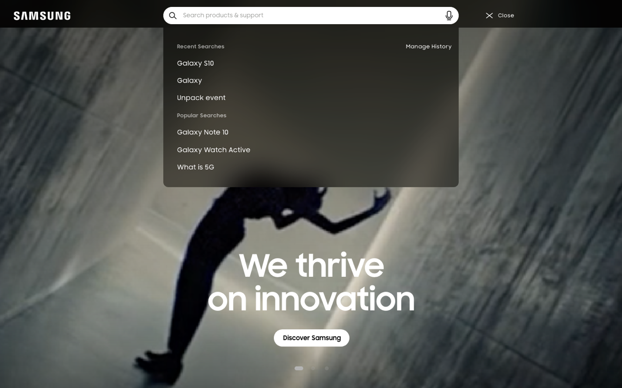
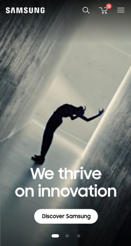
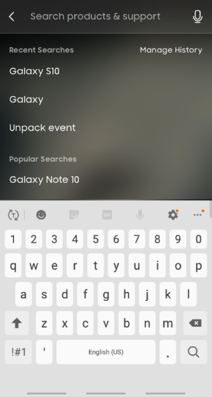
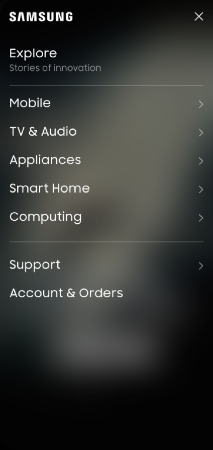
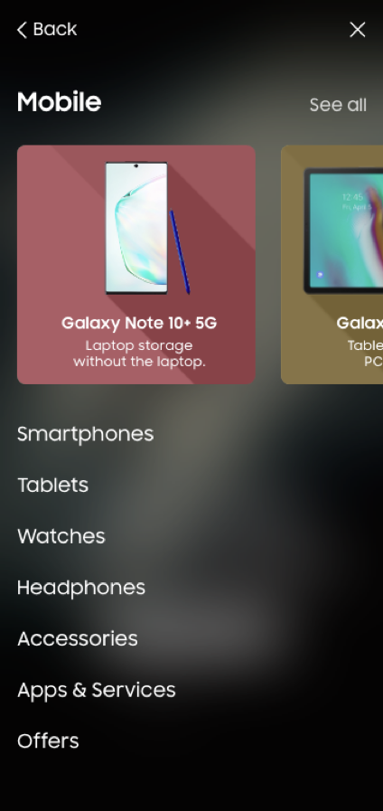
THE GLOBAL NAVIGATION
Establish a new, mobile-first, navigation paradigm that represents products visually and organises information in a way that is clear and intuitive to high intent users.
Global navigation characteristics:
- Simplified global navigation bar, which consolidates navigation elements into more consumer-centric categories.
- The account and cart remain in their existing position, but we put foward the search element with a search field.
- Upon interaction, the navigation bar opens as an overlay. As the user gets deeper into the nav, a visual panel displaying products updates to feature relevant products.

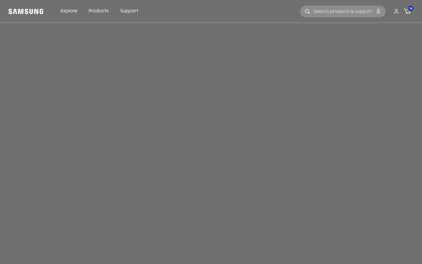
Current Samsung navigation
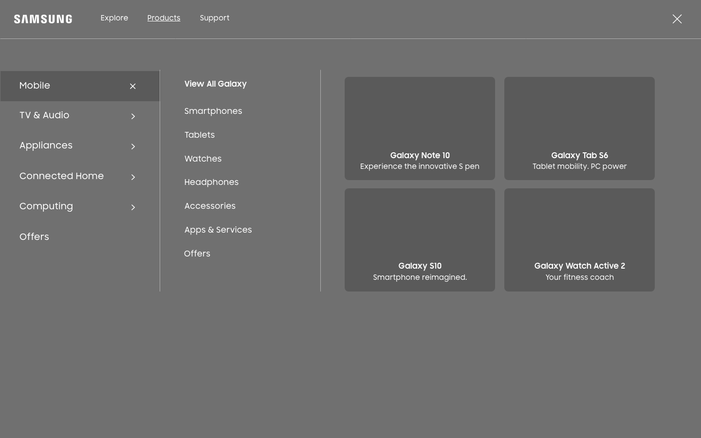
Initial wireframes
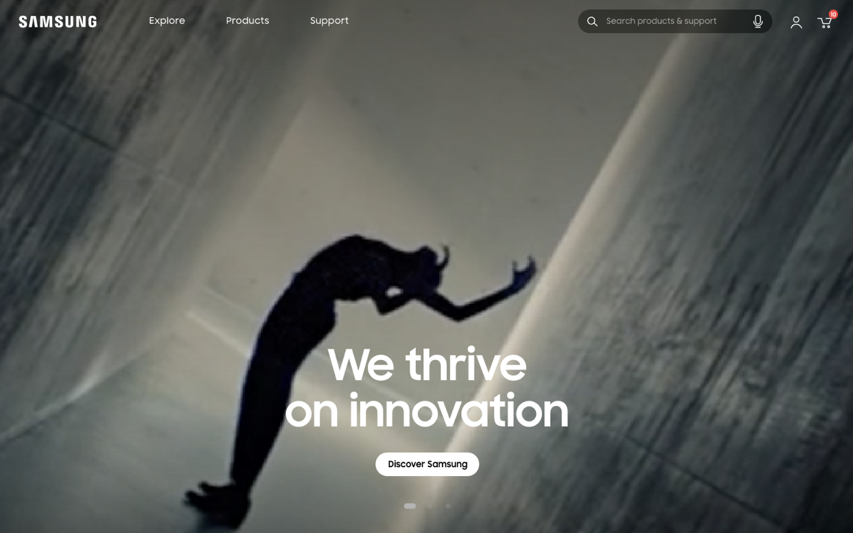
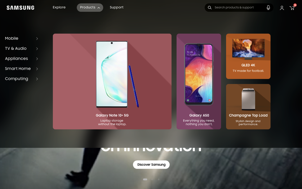
Final mockups
THE COMPARE TOOL
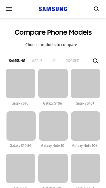
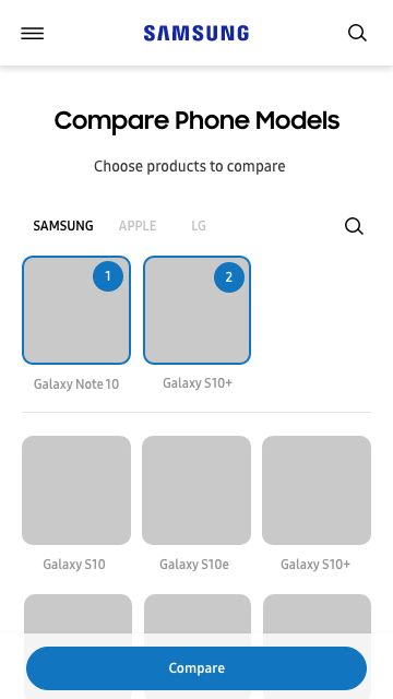
The Compare tool should help users narrow down their choice and limit the amount of sources they feel the need to consult when doing product research. We created a more user-friendly compare tool from the ones they currently have. Additionally, we consolidated the multiple compare tool they have into one that works for all product types.
New compare tool characteristics:
- We originally wanted to offer the ability to compare both Samsung products and competitor products to ensure transparency and instill trust. The client removed the option at the end for internal political reasons.
- Describes features in accessible and simplified language
- Progressive disclosure of device information, with most relevant information related to the product shown at the top.
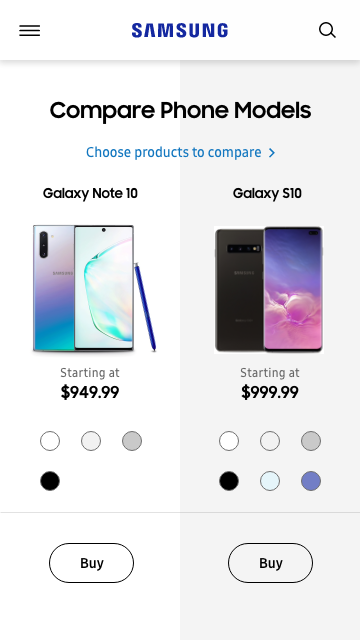
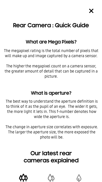
Wireframes
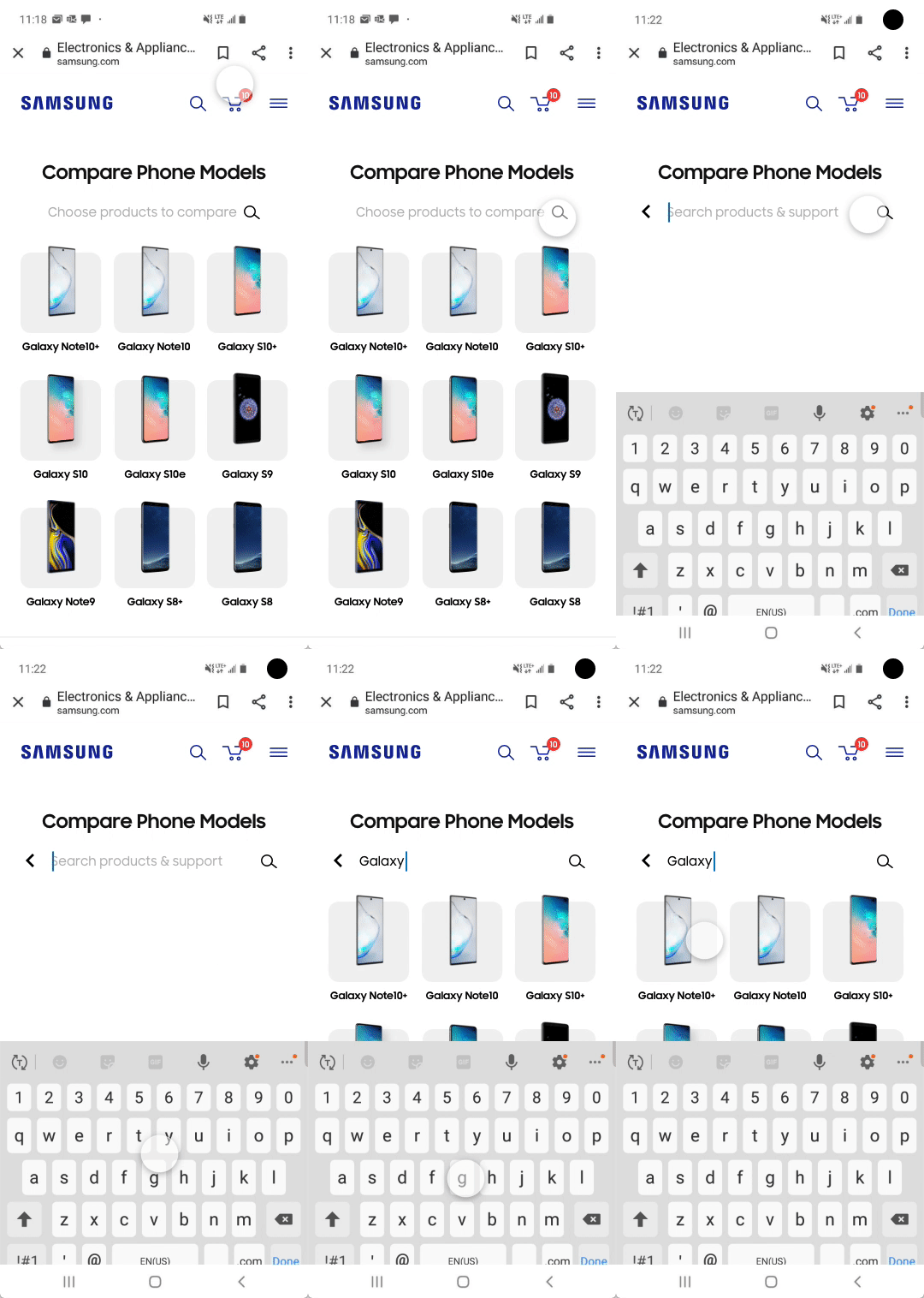
Final animated mockup
HOMEPAGE
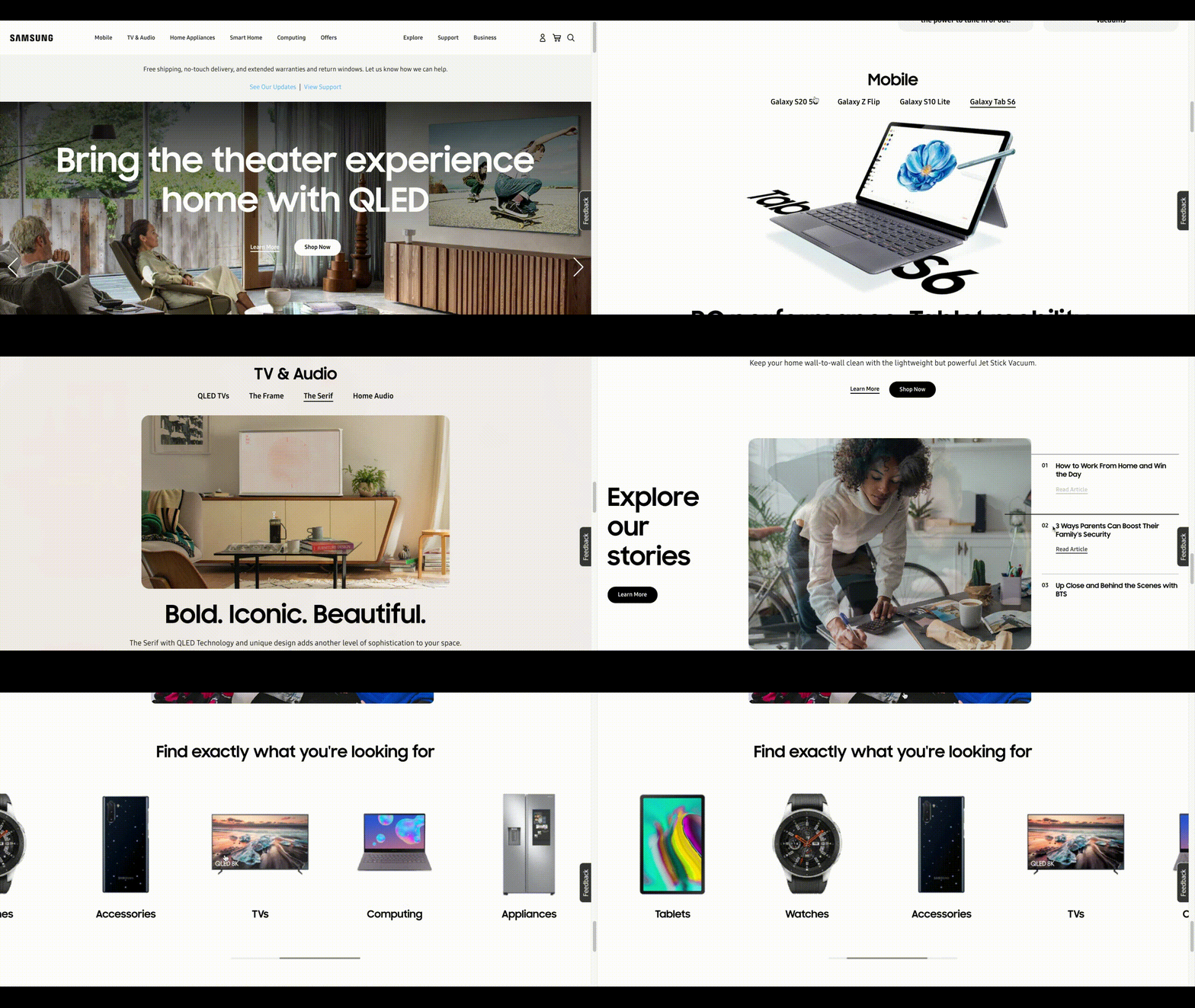
The strategy for the homepage programming is centered around serving both low- and high-intent users. This is done by visually displaying Samsung’s product offering right after the main hero banner to ensure people who know what they are looking for can easily find it, and by providing multiple pathways for exploration for people who don’t know exactly what they are looking for. The homepage is also an opportunity to instill trust and interest by adding storytelling elements.
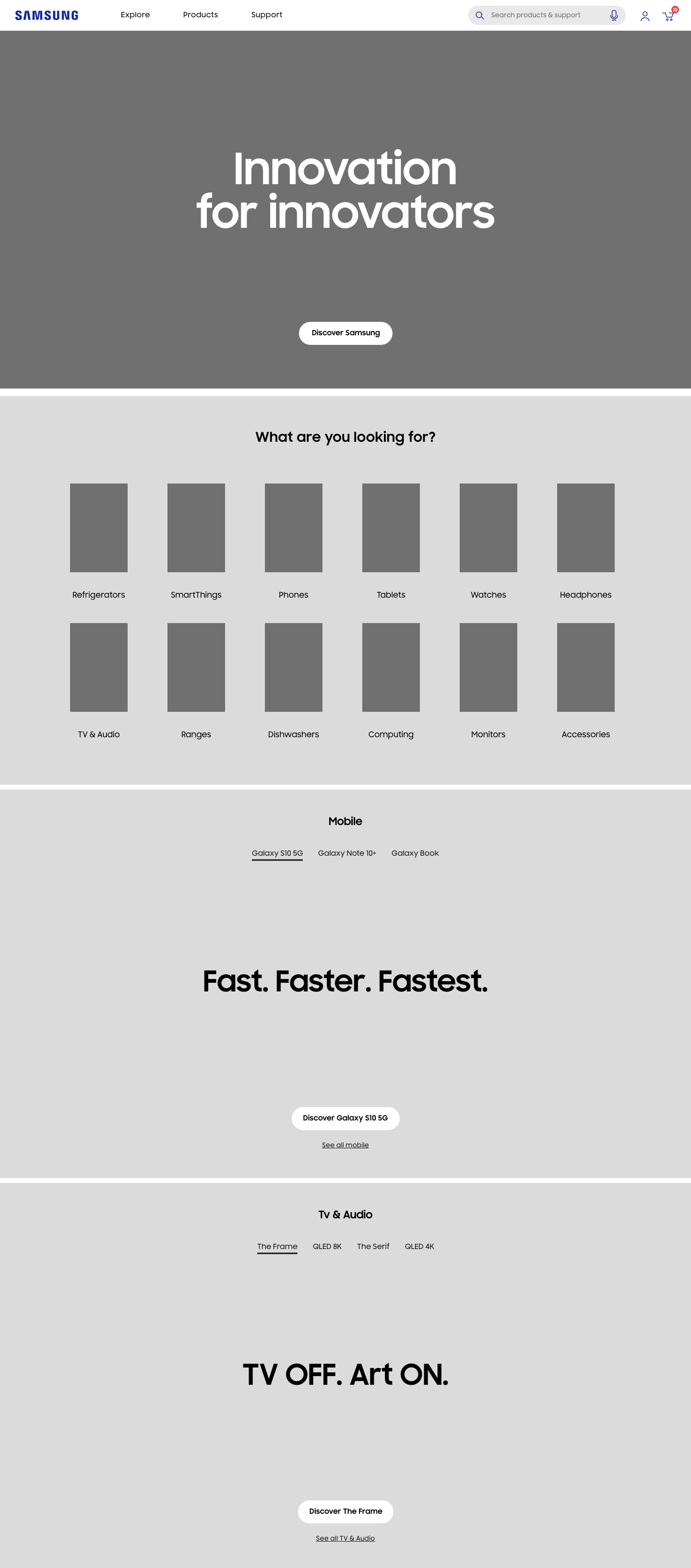
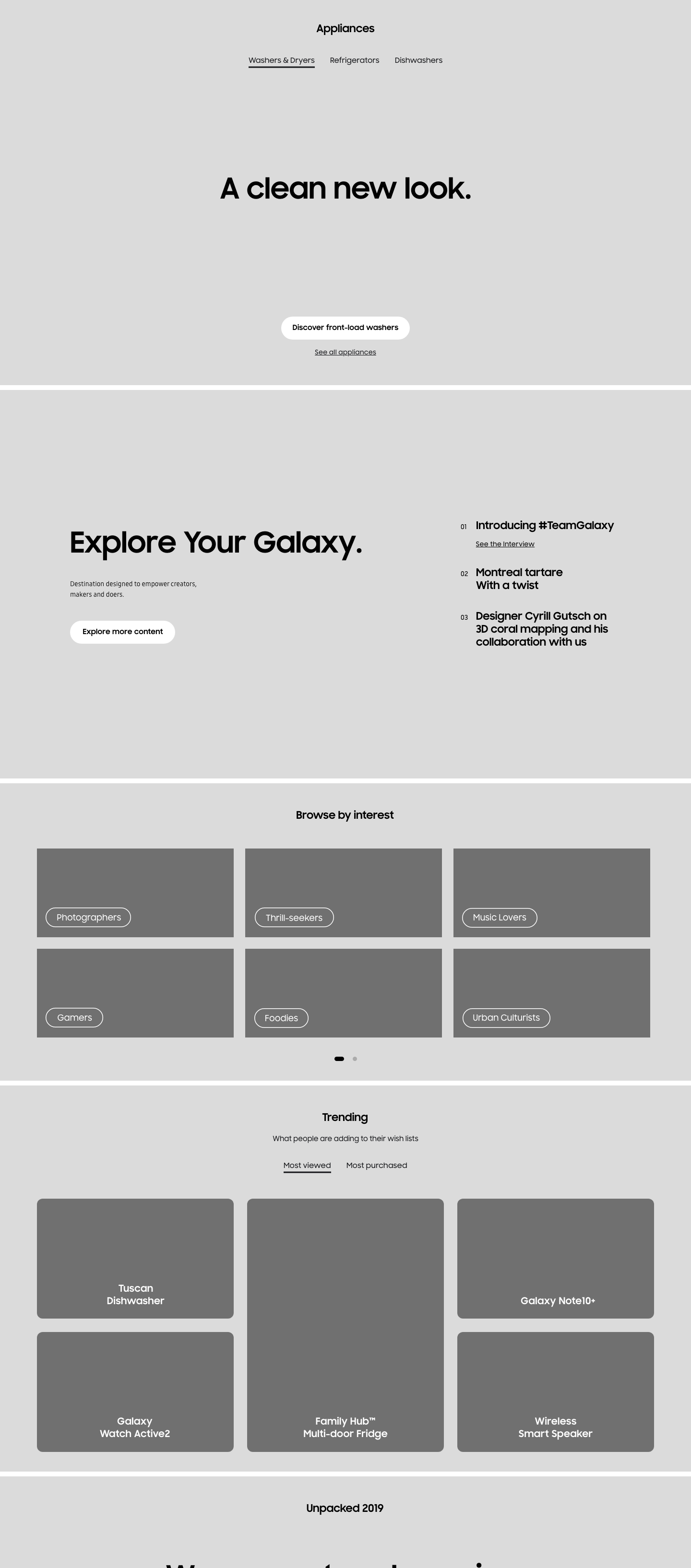
Desktop wireframes
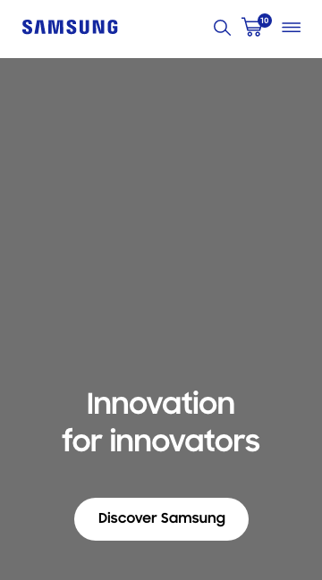
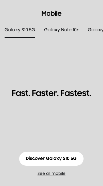
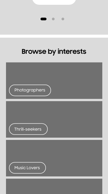
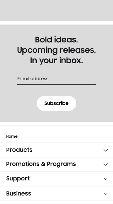
Mobile wireframes
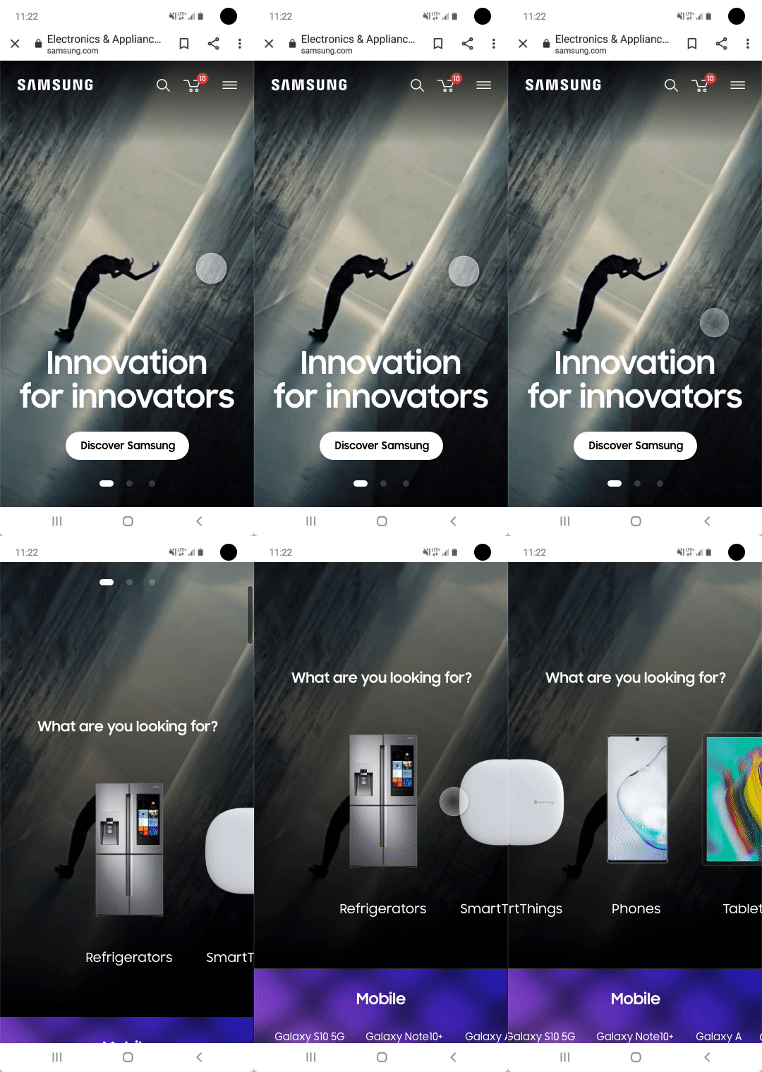
Final mobile animated mockup
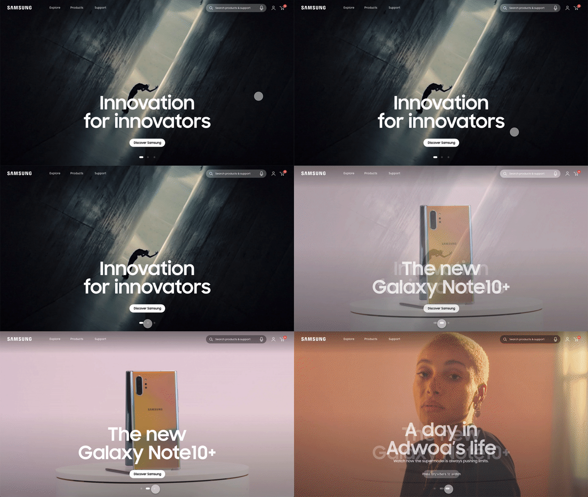
Final desktop animated mockup
CONCLUSION & LEARNINGS
Overall, I learned a lot from working on this project. Working with such a big organization was different than most projects I have worked. Navigating the various politics within an organization was challenging and I learned to compromize in order to keep going and deliver the best product I can.
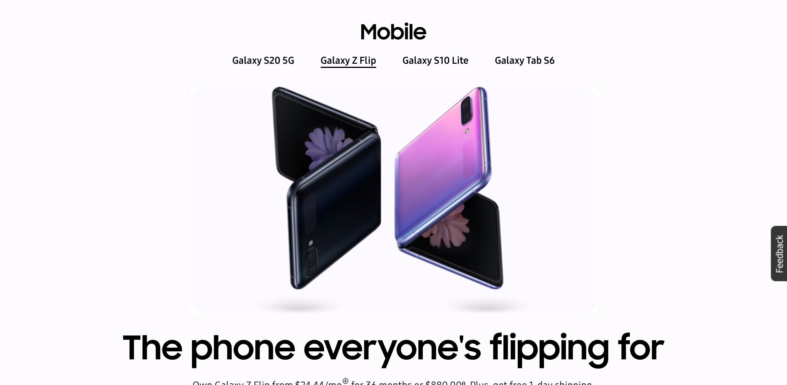
This is what is currently live on the US Samsung website. They implemented several elements we proposed even though they tweaked a few things.
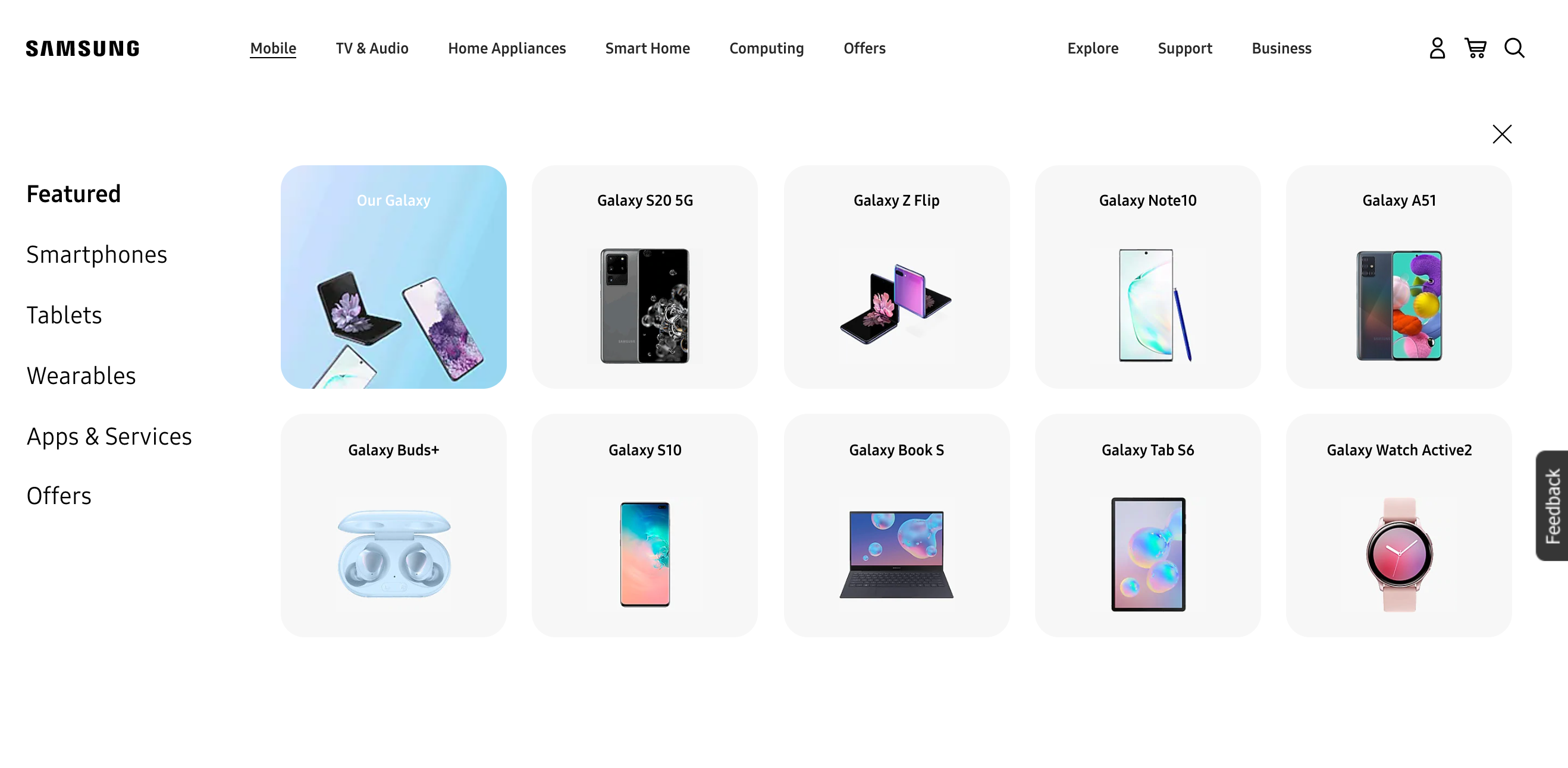
Selected Works
